What Fonts Go With Birds of Paradise? Serif and Sans Pairings
Birds of Paradise does the talking, so the font next to it should stay quiet. Here are pairings that work, with sizes.
Editorial team · First published .
Quick answer
Pair Birds of Paradise with a calm serif like Cormorant Garamond or Playfair Display for invitations, or a clean sans-serif like Montserrat or Plus Jakarta Sans (in spaced-out capitals) for modern branding. Avoid pairing it with another script, and keep the script at least 2.5× the size of the supporting text.
The basic rule: one script per design
Serif pairing: Cormorant Garamond or Playfair Display
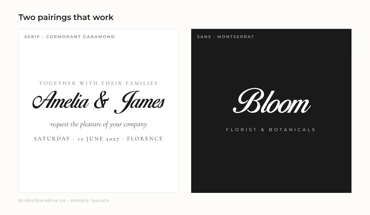
h1 { font-family: "Birds of Paradise", cursive; font-size: 56px; }
h2, p { font-family: "Cormorant Garamond", serif; font-size: 18px; letter-spacing: 0.05em; }
Sans-serif pairing: Montserrat or Plus Jakarta Sans
.brand-name { font-family: "Birds of Paradise", cursive; font-size: 48px; }
.brand-tagline { font-family: "Plus Jakarta Sans", sans-serif; font-size: 12px; text-transform: uppercase; letter-spacing: 0.25em; }
Sizing: keep a big gap
Frequently asked questions
What serif font goes with Birds of Paradise?
Cormorant Garamond and Playfair Display both work well, especially for wedding invitations. Use the script for names and the serif for details.
Can I pair Birds of Paradise with another script font?
It is best not to. Two decorative scripts compete with each other. Pair it with a plain serif or sans-serif instead.
See your own text in Birds of Paradise
Preview names and words, or export them as an SVG for Cricut, Silhouette or a tattoo stencil.